6 Color Theory Tips to Enhance Your Beading Designs

PAGE VARIABLES - ONLY VISIBLE ON EDIT MODE *

Subtitle

We have had countless Potomac Bead customers express their frustration with choosing colors for their jewelry projects. We hear things like "how to choose colors, it’s the hardest part of making jewelry” and “could you help me? I don’t know where to begin.” As an artist and former art educator, I always enjoy helping people choose colors for their projects. Color happens to be my favorite part of design in general as you can tell from my colorful arm tattoo.

Blog Date

February 23, 2024

Blog Author

By Ashley Krzanowski

Blog Tags

Blog Category

bodyHtml

Notes: Only visible on edit mode. Update the variables above > save > then reload the page to load the values.

Picture of Person, Skin, Tattoo

Short Desc and Page Image for the thumbnails showing on other pages.

February 23, 2024

By Ashley Krzanowski

Picture of Person, Skin, Tattoo

We have had countless Potomac Bead customers express their frustration with choosing colors for their jewelry projects. We hear things like "how to choose colors, it’s the hardest part of making jewelry” and “could you help me? I don’t know where to begin.” As an artist and former art educator, I always enjoy helping people choose colors for their projects. Color happens to be my favorite part of design in general as you can tell from my colorful arm tattoo.

As The Potomac Bead Company continues to grow and evolve, so does the way we share our knowledge and inspiration with you. Therefore, I want to share with you some color theory tools that will help you to create new, interesting, and exciting designs. This will help you get out of the rut of using the same colors over and over. For these tips I will be using a color wheel I made as the main tool in helping choose colors. If you do not have time to make your own, you can purchase a detailed color wheel from us online!

COLOR TIP 1: Primary, Secondary, Triads

The Primary Colors (Red, Yellow, Blue) are “primary” because they are the only colors that can not be made. When mixed together, the Primary Colors create The Secondary Colors (Orange, Green, Purple). These colors form the basis for the color wheel. They also are great examples of Triadic Colors. Both the Primary Colors and the Secondary Colors create a Triad or triangle with equal sides on the color wheel. When you want to use three colors in a design consider three colors that form a triangle on the color wheel as depicted.

color wheel triad
color wheel triad

COLOR TIP 2: Analogous Colors

The color wheel forms a continuous circle of colors that blend from one to the next. Colors that are next to each other on the color wheel are called Analogous Colors. For example: If you really enjoy the color Violet for instance but want to use other colors with it, you could choose colors on either side of it (Blue Violet, Blue or Red Violet, Red) to create an Analogous Color Harmony as depicted.

Color Wheel Analogous
Analogous Colors

COLOR TIP 3: Complementary Colors

Colors that are directly across from each other on the color wheel are Complementary Colors. For example: If you want to create a piece of jewelry using mainly blue colors, you may want to use it’s complement orange to add some small pops of color throughout your piece. Every color on the color wheel has a complement, as depicted. What is the complement of your favorite color? Here is a sample of a YouTube video in which we used two complementary colors.

color wheel complementary

COLOR TIP 4: Split Complementary Colors

The Split Complementary Color Harmony is a twist on Complementary Colors. Instead of choosing the color directly across from another color you choose the two colors on either side of it. For example: The main color you are using is Red. The Complementary Color of Red is Green. In a Split Complementary Color Harmony you would choose Yellow Green and Blue Green which are on either side of green instead of just green. Like the Triadic Color Harmony, this gives you three interesting colors to work with.

color wheel split complimentarys
split complimentary color beads

COLOR TIP 5: Warm and Cool Colors

The color wheel can be divided down the middle into Warm and Cool Colors. Warm Colors are colors that remind us of things that are hot or warm such as: fire, light, the sun, etc like the SuperDuo mix Autumn Fire (below). Likewise, Cool Colors are colors that remind us of things that are cool such as: water, ice, rain dripping off leaves, etc. like the DiscDuo Mix Blue Skies (below). Using a combination of Warm Colors or Cool Colors in your designs can give your piece more depth and interest.

Autumn Colored Beds
Sky Colored Beads
color wheel warm colors
color wheel cool colors

COLOR TIP 6: Neutral Colors

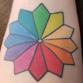
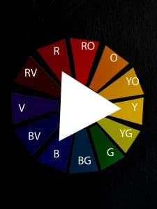
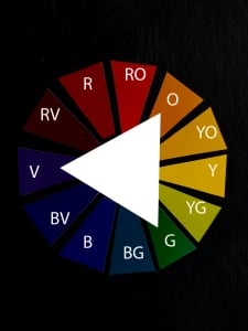
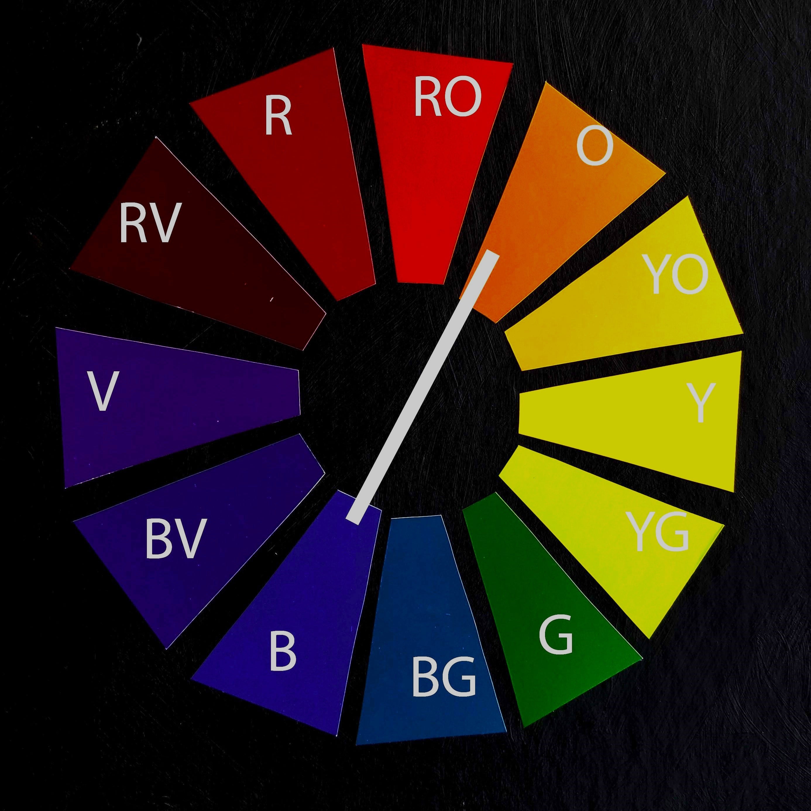
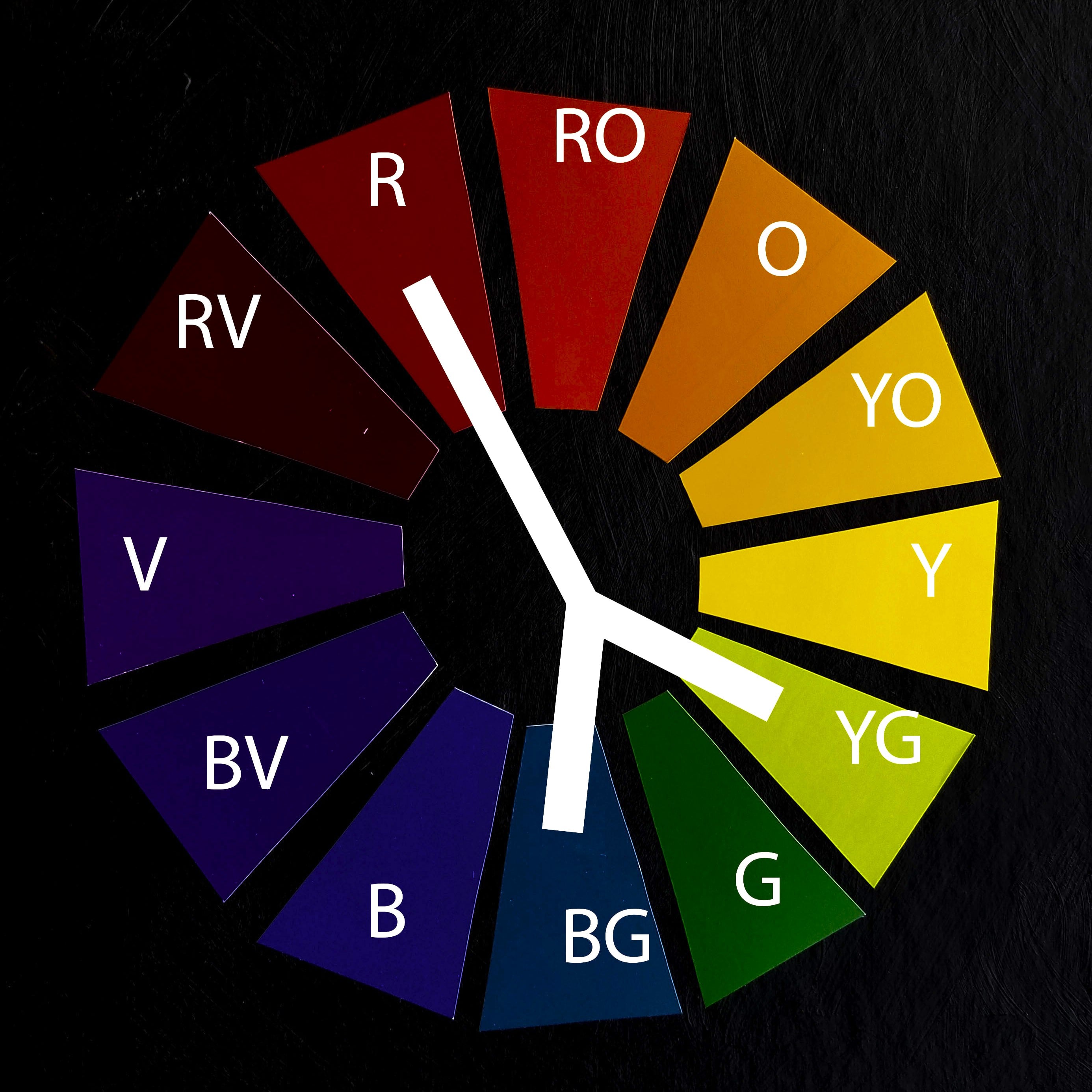
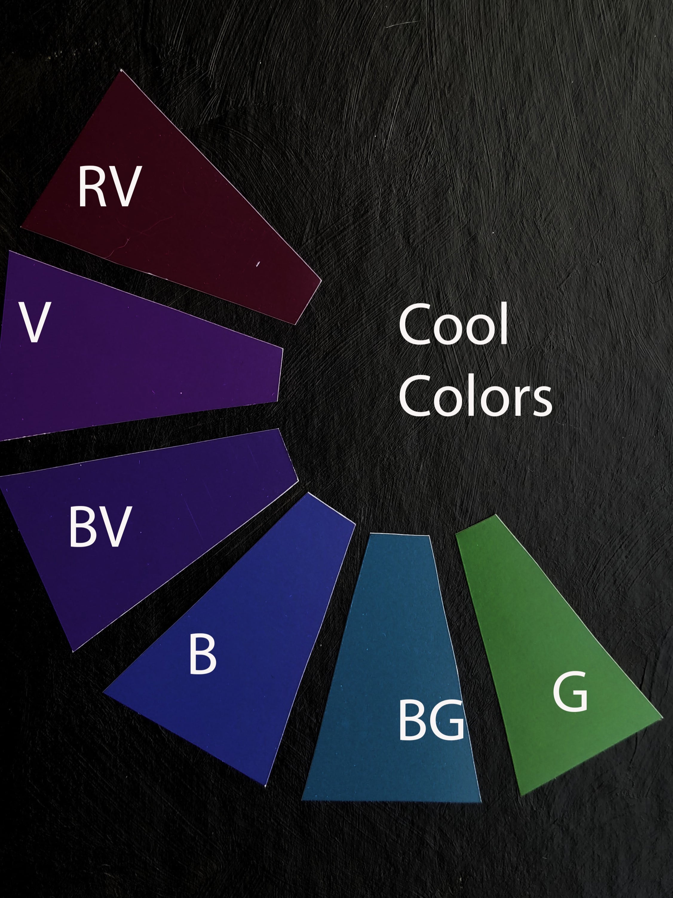
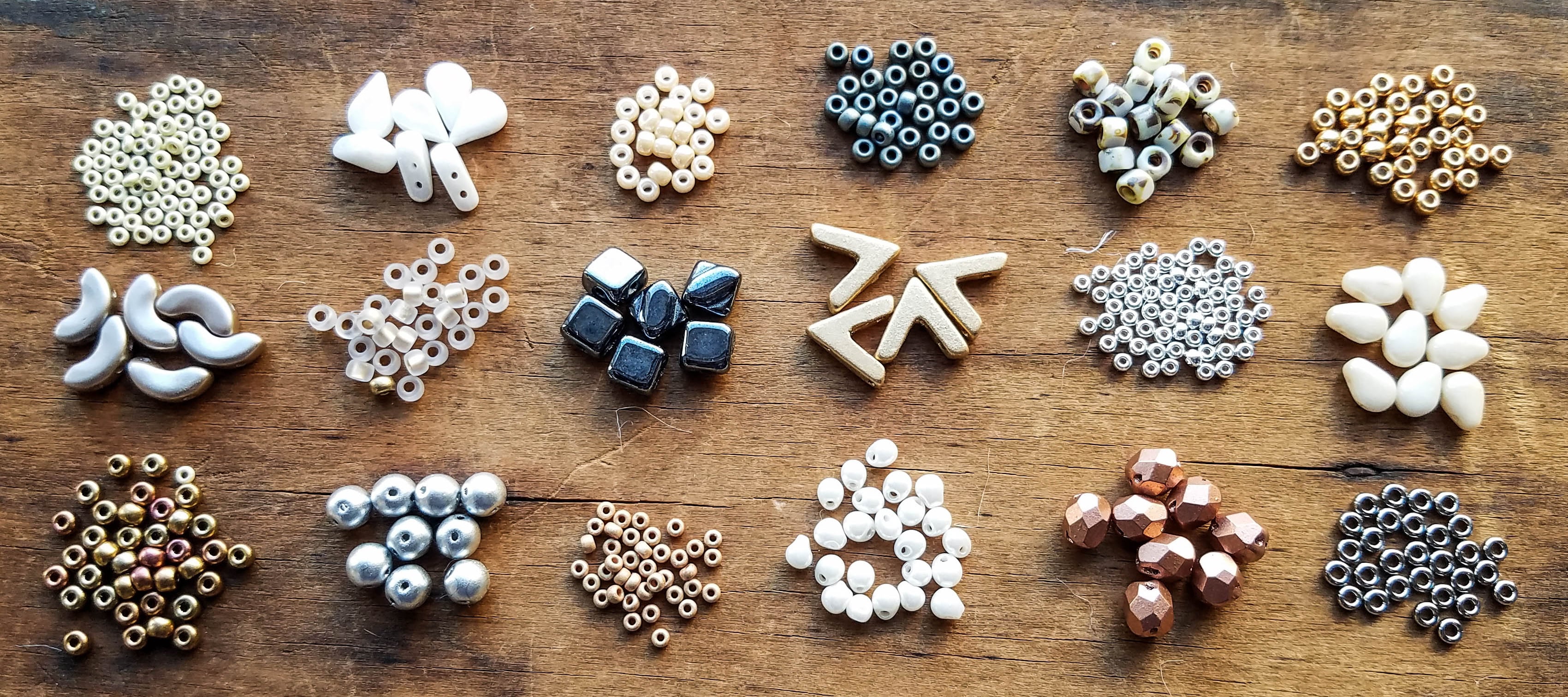
So, what about all the colors you don’t see on this color wheel? When many colors are mixed together, a Neutral Color can be made such as brown, black, grey, etc. These colors can be warm or cool depending on the ratio of warm to cool colors used to make them, but they are still considered Neutral. Neutral Colors are great because they can accent or go with just about any color. In beading, Neutral Colors can also be gold, silver, and other metallics along with black, grey, brown or white. All these colors can be added into your designs without taking over the whole piece. They can also be used together on their own to create a classic look.

Neutral Colored Beads

I hope these 6 color theory tips are helpful and that you can add them to your design “toolbox” to give you more confidence in choosing colors and enhance your jewelry projects. If you need more help in choosing your colors, check out Tereza's blog on choosing colors for your next beading project. We look forward to gathering your bead orders and seeing your project color selections! Share your finished projects with us on Facebook! We love to see your work!

- Ashley Krzanowski
potomacbeads.com